自定义控件TreeView
原创2024年1月2日大约 4 分钟
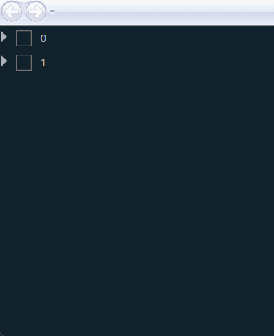
自带的TreeView没有Checkbox,需要自定义设计实现效果
定义模型
定义需要显示的数据ViewModel
public class TreeItemViewModel : INotifyPropertyChanged
{
    public required string Name { get; set; }

    public Visibility HasPath { get { if (Parent == null) return Visibility.Collapsed; return Visibility.Visible; } }

    private bool _isChecked = false;
    public bool IsChecked { get { return _isChecked; } set { _isChecked = value;
            OnPropertyChanged(nameof(IsChecked));
        } }

    public TreeItemViewModel? Parent { get; set; }

    public List<TreeItemViewModel>? Children { get; set; }

    public event PropertyChangedEventHandler? PropertyChanged;
    private void OnPropertyChanged(string propName)
    {
        if (this.PropertyChanged != null)
        {
            this.PropertyChanged(this, new PropertyChangedEventArgs(propName));
        }
    }
}
定义CheckBox点击事件Command
public class RelayCommand<T> : ICommand where T : class
{
    private Action<T> _execute;
    private Func<T,bool> _canExecute;
    public RelayCommand(Action<T> execute,Func<T,bool> canExecute)
    {
        if(execute==null) throw new ArgumentNullException(nameof(execute));

        _execute = execute;
        _canExecute = canExecute;
    }

    public event EventHandler? CanExecuteChanged;

    public bool CanExecute(object? parameter)
    {
        return _canExecute == null ? true : _canExecute((T)parameter);
    }

    public void Execute(object? parameter)
    {
        _execute((T)parameter);
    }
}
定义TreeView中的VM
public class TreeViewModel
{
    public ObservableCollection<TreeItemViewModel> ProductList { get; set; }

    public ICommand CheckedCommand { get; private set; }

    private readonly int MAX = 6;

    public TreeViewModel()
    {
        CheckedCommand = new RelayCommand<TreeItemViewModel>((vm) =>
        {
            var checkedCount=  ProductList.SelectMany(it => it.Children)
            .Count(it => it.Parent != null && it.IsChecked == true);

            var reamin = MAX - checkedCount;
            if (vm.Parent == null)
            {
                if (vm.Children != null)
                {
                    for (var i = 0; i < vm.Children.Count; i++)
                    {
                        if (i < reamin)
                        {
                            vm.Children[i].IsChecked = true;
                        }
                    }
                    var allChecked = vm.Children.Any(it => it.IsChecked == false);
                    if (allChecked)
                    {
                        vm.IsChecked = false;
                    }
                    else
                    {
                        vm.IsChecked = true;
                    }
                }
            }
            else
            {
                var allChecked = vm.Parent.Children.Any(it => it.IsChecked == false);
                if (allChecked)
                {
                    vm.Parent.IsChecked = false;
                }
                else
                {
                    vm.Parent.IsChecked = true;
                }
            }

            if (checkedCount > MAX)
            {
                vm.IsChecked = false;
                MessageBox.Show($"最多选{MAX}个");
                return;
            }
        }, (vm) => { return true; });

        ProductList = new ObservableCollection<TreeItemViewModel>();

        var parent0 = new TreeItemViewModel() { Name = "0", Parent = null };
        parent0.Children = new List<TreeItemViewModel>()
        {
                new TreeItemViewModel() {Name="01",Parent=parent0},
                new TreeItemViewModel() {Name="02",Parent=parent0},
                new TreeItemViewModel() {Name="03",Parent=parent0},
                new TreeItemViewModel() {Name="04",Parent=parent0},
        };

        var parent1 = new TreeItemViewModel() { Name = "1",Parent=null};
        parent1.Children = new List<TreeItemViewModel>()
        {
                new TreeItemViewModel() {Name="11",Parent=parent1},
                new TreeItemViewModel() {Name="12",Parent=parent1},
                new TreeItemViewModel() {Name="13",Parent=parent1},
                new TreeItemViewModel() {Name="14",Parent=parent1},
                new TreeItemViewModel() {Name="15",Parent=parent1},
                new TreeItemViewModel() {Name="16",Parent=parent1},
                new TreeItemViewModel() {Name="17",Parent=parent1},
                new TreeItemViewModel() {Name="18",Parent=parent1},
                new TreeItemViewModel() {Name="19",Parent=parent1},
        };

        ProductList.Add(parent0);
        ProductList.Add(parent1);
    }
}
定义样式
定义TreeViewItem显示样式
使用HierarchicalDataTemplate进行数据迭代
    <HierarchicalDataTemplate x:Key="TreeItemTemplate" ItemsSource="{Binding Children}">
    <StackPanel Orientation="Horizontal">
        <CheckBox
            Margin="5"
            VerticalAlignment="Center"
            Command="{Binding DataContext.CheckedCommand, RelativeSource={RelativeSource Mode=FindAncestor, AncestorType={x:Type TreeView}}}"
            CommandParameter="{Binding}"
            IsChecked="{Binding IsChecked}"
            Style="{StaticResource CheckBoxStyle}" />
        <Path
            Width="26"
            Height="20"
            Margin="5"
            Fill="White"
            Opacity="0.65"
            Stretch="Uniform"
            Visibility="{Binding HasPath}">
            <Path.Data>
                <PathGeometry Figures="M1024.2 480L861.9 710c-9.3 13.2-21.5 23.7-35.4 30.9-13.9 7.2-29.5 11.1-45.7 11.1-18.7 0-37-5.3-52.8-15.2L98.4 341.5C87.8 334.8 79.2 325.6 73.3 315c-5.9-10.7-9.1-22.8-9.1-35.3 0-15.3 4.8-30.3 13.8-42.8l117.6-163c9.3-12.9 21.4-23.1 35.1-30.1 13.7-7 29.1-10.8 45-10.8 18.4 0 36.4 5.1 52.1 14.8L1024.2 480zM754.1 768c-11.1 0-22-1.5-32.6-4.5-10.6-3-20.7-7.4-30.2-13.2l-611.8-373c-6.7-4.1-15.3 0.7-15.3 8.6v22.6c0 14.6 7.6 28.2 20 35.8l182.5 112.3C241.2 572 224.2 600 224.2 632c0 20.2 6.8 38.8 18.3 53.7a62.518 62.518 0 0 1-44.2 18.3H64.2v-46.8c0-29-19.5-54.4-47.6-61.9L0.2 591l-0.2 369 28.8-14.3c21.7-10.8 35.5-33 35.5-57.3V768h135.5c25.9 0 50.8-10.3 69.2-28.7l3.1-3.1c10.6-10.6 25-16.3 40-16.3h0.2c46.4 0 84.4-35.9 87.8-81.4L674.2 807.2c9.2 5.7 19.9 8.7 30.7 8.7 9.8 0 19.3-2.5 27.7-6.9 8.4-4.5 15.7-11 21.1-19.2l6.8-10.1c3.2-5-0.4-11.7-6.4-11.7zM312.2 656c-13.2 0-24-10.8-24-24s10.8-24 24-24 24 10.8 24 24-10.8 24-24 24z" />
            </Path.Data>
        </Path>
        <TextBlock
            Margin="5"
            VerticalAlignment="Center"
            Foreground="White"
            Opacity="0.65"
            Text="{Binding Name}" />
    </StackPanel>
</HierarchicalDataTemplate>
自定义Checkbox样式
<Style x:Key="CheckBoxStyle" TargetType="{x:Type CheckBox}">
    <Setter Property="BorderThickness" Value="1" />
    <Setter Property="Padding" Value="0" />
    <Setter Property="Cursor" Value="Hand" />
    <Setter Property="HorizontalAlignment" Value="Center" />
    <Setter Property="Cursor" Value="Hand" />
    <Setter Property="Template">
        <Setter.Value>
            <ControlTemplate TargetType="{x:Type CheckBox}">
                <Grid SnapsToDevicePixels="true">
                    <Grid.ColumnDefinitions>
                        <ColumnDefinition Width="18" />
                        <ColumnDefinition Width="Auto" />
                    </Grid.ColumnDefinitions>
                    <Border
                        x:Name="PART_Border"
                        Grid.Column="0"
                        Width="18"
                        Height="18"
                        Background="Transparent"
                        BorderBrush="{TemplateBinding BorderBrush}"
                        BorderThickness="{TemplateBinding BorderThickness}">
                        <Grid>
                            <Path
                                x:Name="PART_Checked"
                                Data="M 2,8 L 7,13 14,2"
                                Stroke="{TemplateBinding BorderBrush}"
                                StrokeThickness="2"
                                Visibility="Collapsed" />
                            <Rectangle
                                x:Name="PART_Rect"
                                Width="18"
                                Height="18"
                                Fill="{TemplateBinding BorderBrush}"
                                RadiusX="2"
                                RadiusY="2"
                                Visibility="Collapsed" />
                        </Grid>
                    </Border>
                    <ContentPresenter
                        Grid.Column="1"
                        Margin="{TemplateBinding Padding}"
                        HorizontalAlignment="{TemplateBinding HorizontalContentAlignment}"
                        VerticalAlignment="{TemplateBinding VerticalContentAlignment}"
                        RecognizesAccessKey="True"
                        SnapsToDevicePixels="{TemplateBinding SnapsToDevicePixels}" />
                </Grid>
                <ControlTemplate.Triggers>
                    <Trigger Property="IsChecked" Value="true">
                        <Setter TargetName="PART_Checked" Property="Visibility" Value="Visible" />
                        <Setter TargetName="PART_Border" Property="Background" Value="#1890FF" />
                        <Setter TargetName="PART_Border" Property="BorderBrush" Value="#1890FF" />
                        <Setter TargetName="PART_Checked" Property="Stroke" Value="White" />
                    </Trigger>
                    <Trigger Property="IsChecked" Value="{x:Null}">
                        <Setter TargetName="PART_Rect" Property="Visibility" Value="Visible" />
                    </Trigger>
                    <Trigger Property="HasContent" Value="true">
                        <Setter Property="Padding" Value="4,0,0,0" />
                    </Trigger>
                </ControlTemplate.Triggers>
            </ControlTemplate>
        </Setter.Value>
    </Setter>
</Style>
定义Treeview左边三角形
<Style x:Key="ExpandCollapseToggleStyle" TargetType="{x:Type ToggleButton}">
    <Setter Property="Focusable" Value="False" />
    <Setter Property="Cursor" Value="Hand" />
    <Setter Property="VerticalAlignment" Value="Center" />
    <Setter Property="Template">
        <Setter.Value>
            <ControlTemplate TargetType="{x:Type ToggleButton}">
                <Border Background="Transparent">
                    <Path
                        x:Name="PART_Expand"
                        Data="M0,0 L0,8 L8,0"
                        Fill="White"
                        Opacity="0.65"
                        Stroke="White">
                        <Path.RenderTransform>
                            <RotateTransform Angle="135" CenterX="3" CenterY="3" />
                        </Path.RenderTransform>
                    </Path>
                </Border>
                <ControlTemplate.Triggers>
                    <Trigger Property="IsChecked" Value="True">
                        <Setter TargetName="PART_Expand" Property="RenderTransform">
                            <Setter.Value>
                                <RotateTransform Angle="180" CenterX="3" CenterY="3" />
                            </Setter.Value>
                        </Setter>
                    </Trigger>
                </ControlTemplate.Triggers>
            </ControlTemplate>
        </Setter.Value>
    </Setter>
</Style>
定义TreeViewItem样式
<Style x:Key="TreeItemStyle" TargetType="{x:Type TreeViewItem}">
    <Setter Property="Template">
        <Setter.Value>
            <ControlTemplate TargetType="{x:Type TreeViewItem}">
                <Grid>
                    <Grid.ColumnDefinitions>
                        <ColumnDefinition Width="Auto" />
                        <ColumnDefinition Width="Auto" />
                        <ColumnDefinition Width="Auto" />
                    </Grid.ColumnDefinitions>
                    <Grid.RowDefinitions>
                        <RowDefinition Height="Auto" />
                        <RowDefinition Height="Auto" />
                    </Grid.RowDefinitions>
                    <ToggleButton
                        x:Name="PART_Expander"
                        Grid.Row="0"
                        Grid.Column="0"
                        ClickMode="Press"
                        IsChecked="{Binding Path=IsExpanded, RelativeSource={RelativeSource TemplatedParent}}"
                        Style="{StaticResource ExpandCollapseToggleStyle}" />
                    <Border
                        x:Name="PART_Border"
                        Grid.Row="0"
                        Grid.Column="1"
                        Margin="5,0">
                        <ContentPresenter x:Name="PART_Header" ContentSource="Header" />
                    </Border>
                    <ItemsPresenter
                        x:Name="ItemsHost"
                        Grid.Row="1"
                        Grid.Column="1"
                        Grid.ColumnSpan="2" />
                </Grid>
                <ControlTemplate.Triggers>
                    <Trigger Property="IsExpanded" Value="false">
                        <Setter TargetName="ItemsHost" Property="Visibility" Value="Collapsed" />
                    </Trigger>
                    <Trigger Property="HasItems" Value="false">
                        <Setter TargetName="PART_Expander" Property="Visibility" Value="Hidden" />
                    </Trigger>
                </ControlTemplate.Triggers>
            </ControlTemplate>
        </Setter.Value>
    </Setter>
</Style>
定义TreeView样式
<Style x:Key="TreeStyle" TargetType="{x:Type TreeView}">
    <Setter Property="Background" Value="Transparent" />
    <Setter Property="ItemsPanel">
        <Setter.Value>
            <ItemsPanelTemplate>
                <VirtualizingStackPanel
                    IsItemsHost="True"
                    IsVirtualizing="True"
                    VirtualizationMode="Recycling" />
            </ItemsPanelTemplate>
        </Setter.Value>
    </Setter>
</Style>
用户控件使用
<TreeView
    ItemContainerStyle="{StaticResource TreeItemStyle}"
    ItemTemplate="{StaticResource TreeItemTemplate}"
    ItemsSource="{Binding ProductList}"
    Style="{StaticResource TreeStyle}" />
public partial class TreeViewDemo : UserControl
{
public TreeDemo()
{
InitializeComponent();
DataContext = new TreeViewModel();
}
}