Binding
WPF中Binding随处可见,简化代码量,整理一些常用的示例供参考。
绑定控件
<Slider
    x:Name="Slider"
    Maximum="100"
    Minimum="0" />
<TextBlock Text="{Binding ElementName=Slider, Path=Value}" />
<TextBox Text="{Binding ElementName=Slider, Path=Value}" />
TextBlock和TextBox的Text属性Binding到Slider控件的Value属性。Slider值变动,TextBlock和TextBox的值跟着变动。
更改TextBox的值,Slider控件值并没有跟着变动。
<Slider
    x:Name="Slider"
    Maximum="100"
    Minimum="0" />
<TextBlock Text="{Binding ElementName=Slider, Path=Value}" />
<TextBox Text="{Binding ElementName=Slider, Path=Value, Mode=TwoWay,UpdateSourceTrigger=PropertyChanged}" />
当添加Binding的Mode和UpdateSourceTrigger属性时,实现了双向Binding
静态绑定
xmlns:sys="clr-namespace:System;assembly=mscorlib"<UserControl.Resources>
<sys:String x:Key="demo">测试数据</sys:String>
<vm:KeyValueItem
x:Key="ItemDemo"
Key="123"
Value="456" />
</UserControl.Resources>
<StackPanel Orientation="Vertical">
<TextBlock Text="{Binding Source={StaticResource demo}}" />
<TextBlock Text="{Binding Source={StaticResource ItemDemo}, Path=Key}" />
<TextBlock Text="{Binding Source={StaticResource ItemDemo}, Path=Value}" />
</StackPanel>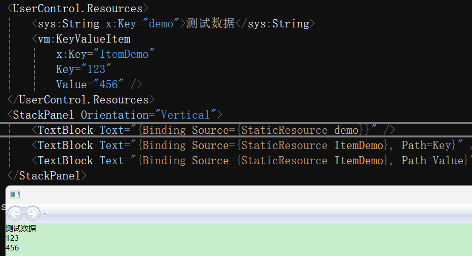
Source属性提供对象的绑定,一般用在静态,Path绑定需要的对象属性值
查找绑定
RelativeSource用于没有设置x:Name的控件,常用于自定义模板。
FindAncestor用于查找父元素,常与AncestoryType、AncestorLevel配合。
AncestorType用于查找父元素类型
AncestorLevel当父元素存在多个相同的元素时,指定具体哪一个,默认0,从当前元素往上查找。
绑定自身
<TextBlock Width="160" Height="160" Background="Orange" Text="{Binding RelativeSource={RelativeSource Mode=Self}, Path=Background}" />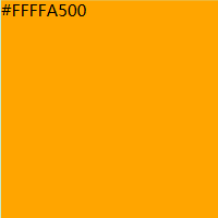
绑定父元素
查找绑定常用自定义控件,自定义模板常用套娃示例
 <Border
     Width="160"
     Height="160"
     Background="Purple">
     <Border
         Width="140"
         Height="140"
         Background="Red">
         <Button
             Width="120"
             Height="120"
             Background="Orange">
             <StackPanel Orientation="Vertical">
                 <TextBlock Text="{Binding RelativeSource={RelativeSource Mode=FindAncestor, AncestorType={x:Type Button}}, Path=Background}" />
                 <TextBlock Text="{Binding RelativeSource={RelativeSource Mode=FindAncestor, AncestorType={x:Type Border}}, Path=Background}" />
                 <TextBlock Text="{Binding RelativeSource={RelativeSource Mode=FindAncestor, AncestorType={x:Type Border}, AncestorLevel=2}, Path=Background}" />
                 <TextBlock Text="{Binding RelativeSource={RelativeSource Mode=FindAncestor, AncestorType={x:Type Border}, AncestorLevel=3}, Path=Background}" />
             </StackPanel>
         </Button>
     </Border>
 </Border>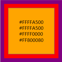
4行高亮:查找的是Button所以值为Orange(#FFFFA500)
5行高亮:查找的是Border,应该是Red(#FFFF0000),但实际值为#FFFFA500,分析Button控件样式,发现内置Border
6行高亮:查找的是Button,AncestorLevel为2,所以值为Red(#FFFF0000)
7行高亮:查找的是Button,AncestorLevel为3,所以值为Purple(#FF800080)
查找上一个数据
还没有遇到使用场景...
<UserControl.Resources>
    <x:Array x:Key="demo" Type="{x:Type vm:KeyValueItem}">
        <vm:KeyValueItem Key="111" Value="444" />
        <vm:KeyValueItem Key="222" Value="555" />
        <vm:KeyValueItem Key="333" Value="666" />
    </x:Array>
</UserControl.Resources>
<ItemsControl ItemsSource="{StaticResource demo}">
    <ItemsControl.ItemTemplate>
        <DataTemplate>
            <StackPanel Orientation="Vertical">
                <TextBlock Foreground="Orange" Text="{Binding}" />
                <TextBlock Foreground="Red" Text="{Binding RelativeSource={RelativeSource Mode=PreviousData}, Path=Key}" />
            </StackPanel>
        </DataTemplate>
    </ItemsControl.ItemTemplate>
</ItemsControl>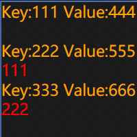
绑定模板
<Label
    Width="100"
    Height="50"
    HorizontalContentAlignment="Center"
    VerticalContentAlignment="Center"
    BorderBrush="Purple"
    BorderThickness="2"
    Content="示例文本"
    Foreground="Orange">
    <Label.Style>
        <Style TargetType="{x:Type Label}">
            <Setter Property="Template">
                <Setter.Value>
                    <ControlTemplate TargetType="{x:Type Label}">
                        <Border
                            Padding="2"
                            BorderBrush="AliceBlue"
                            BorderThickness="{Binding RelativeSource={RelativeSource Mode=FindAncestor, AncestorType={x:Type Label}}, Path=BorderThickness}">
                            <Border BorderBrush="{TemplateBinding BorderBrush}" BorderThickness="{TemplateBinding BorderThickness}">
                                <ContentPresenter HorizontalAlignment="{Binding RelativeSource={RelativeSource Mode=TemplatedParent}, Path=HorizontalContentAlignment}" />
                            </Border>
                        </Border>
                    </ControlTemplate>
                </Setter.Value>
            </Setter>
        </Style>
    </Label.Style>
</Label>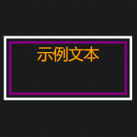
第4行高亮:设置了左右居中,重写了模板,20行处使用查找绑定TemplatedParent进行关联
第5行高亮:设置了上下居中,重写了模板,但是没有任何关联,因此失效
第6、7行高亮:设置Label的边框颜色和宽度,并使用TemplateBinding应用到了新模板上,18行代码处
第18行高亮:使用使用查找绑定边框宽度,与TemplateBinding相比代码量高了很多
第19行高亮:使用使用TemplateBinding绑定边框宽度,与FindAncestor相比代码少了很多
第20行高亮:使用使用TemplatedParent绑定边框宽度,与TemplateBinding相比代码量多了一些,但是这才是原型,简化后就是TemplateBinding
Converter
能直接bingding数据的地方不多,除了重写模板,大部分都需要Converter进行数据转换处理。
<UserControl.Resources>
    <x:Array x:Key="demo" Type="{x:Type vm:KeyValueItem}">
        <vm:KeyValueItem Key="Red" Value="Red" />
        <vm:KeyValueItem Key="Orange" Value="Orange" />
        <vm:KeyValueItem Key="Purple" Value="Purple" />
    </x:Array>
</UserControl.Resources>
<StackPanel Orientation="Vertical">
    <Border Height="30" Background="{Binding ElementName=Colors, Path=SelectedItem.Value}" />
    <ListBox
        x:Name="Colors"
        DisplayMemberPath="Key"
        ItemsSource="{StaticResource demo}"
        SelectedValuePath="Value" />
</StackPanel>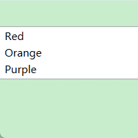
这里直接能用Red来显示具体颜色,是系统自动做了处理,将颜色值改为数字,并添加转换器。
<UserControl.Resources>
<converter:ColorConverter x:Key="ColorConverter" />
<x:Array x:Key="demo" Type="{x:Type vm:KeyValueItem}">
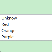
<vm:KeyValueItem Key="Unknow" Value="000" />
<vm:KeyValueItem Key="Red" Value="111" />
<vm:KeyValueItem Key="Orange" Value="222" />
<vm:KeyValueItem Key="Purple" Value="333" />
</x:Array>
</UserControl.Resources>
<StackPanel Orientation="Vertical">
<Border Height="30" Background="{Binding ElementName=Colors, Path=SelectedItem.Value, Converter={StaticResource ColorConverter}}" />
<TextBlock Text="{Binding ElementName=Colors, Path=SelectedItem.Value}" />
<ListBox
x:Name="Colors"
DisplayMemberPath="Key"
ItemsSource="{StaticResource demo}"
SelectedValuePath="Value" />
</StackPanel>public class ColorConverter : IValueConverter
{
public object Convert(object value, Type targetType, object parameter, CultureInfo culture)
{
if(value is string color)
{
switch (color)
{
case "111":
return Brushes.Red;
case "222":
return Brushes.Orange;
case "333":
return Brushes.Purple;
}
}
return Brushes.Black;
}
public object ConvertBack(object value, Type targetType, object parameter, CultureInfo culture)
{
throw new NotImplementedException();
}
}
提示
自定义转换器需要添加到xmlns声明上,才能在XAML里使用
第11行代码:在绑定后加了一个Converter,将自定义转换器绑定上,根据选中的Value值转换成具体的颜色
第12行代码:显示了选中的具体Value值,是无法显示颜色的,因此加上转换器进行转换。
MultiBinding
多重绑定常与转换器结合使用,将多个值转换为目标单一值。
具体示例可以参考按钮权限
IMultiValueConverter
存在Binding、MultiBinding、IValueConverter,那么肯定也存在IMultiValueConverter。
具体示例可以参考按钮权限