Space 间距
原创2024年5月15日大约 3 分钟
基础用法
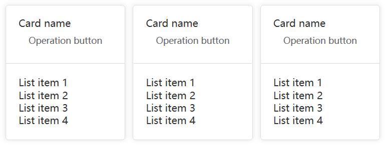
最基础的用法,通过这个组件来给组件之间提供统一的间距。
通过间距组件来给多个组件之间提供间距
<nl:Space>
<nl:Card>
<nl:Card.Header>
<StackPanel Orientation="Vertical">
<TextBlock Text="Card name" />
<Button nl:ButtonAssist.IsText="True" Content="Operation button" />
</StackPanel>
</nl:Card.Header>
<StackPanel Orientation="Vertical">
<TextBlock Text="List item 1" />
<TextBlock Text="List item 2" />
<TextBlock Text="List item 3" />
<TextBlock Text="List item 4" />
</StackPanel>
</nl:Card>
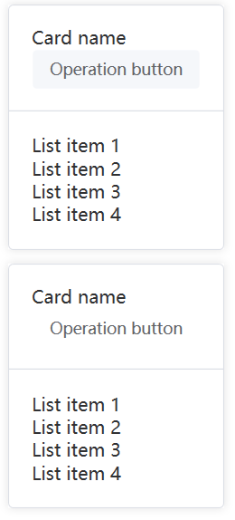
</nl:Space>垂直布局
使用Direction来控制布局的方式
<nl:Space Direction="Vertical">
<nl:Card>
<nl:Card.Header>
<StackPanel Orientation="Vertical">
<TextBlock Text="Card name" />
<Button nl:ButtonAssist.IsText="True" Content="Operation button" />
</StackPanel>
</nl:Card.Header>
<StackPanel Orientation="Vertical">
<TextBlock Text="List item 1" />
<TextBlock Text="List item 2" />
<TextBlock Text="List item 3" />
<TextBlock Text="List item 4" />
</StackPanel>
</nl:Card>
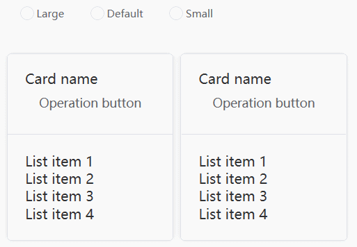
</nl:Space>控制间距的大小
通过调整Size的值来控制间距的大小
使用内置的small、default、large 来设置间距大小,分别对应 8px、12px 和 16px 的间距。 默认的间距大小为 small,也就是 8px。
您也可以通过自定义的 size 来控制大小, 参见下一个部分。
<nl:Space Direction="Vertical" Size="30">
<nl:RadioGroup x:Name="RadioGroup">
<RadioButton Style="{StaticResource RadioButtonStyle}">Large</RadioButton>
<RadioButton Style="{StaticResource RadioButtonStyle}">Default</RadioButton>
<RadioButton Style="{StaticResource RadioButtonStyle}">Small</RadioButton>
</nl:RadioGroup>
<nl:Space Size="{Binding ElementName=RadioGroup, Path=Value}">
<nl:Card>
<nl:Card.Header>
<StackPanel Orientation="Vertical">
<TextBlock Text="Card name" />
<Button nl:ButtonAssist.IsText="True" Content="Operation button" />
</StackPanel>
</nl:Card.Header>
<StackPanel Orientation="Vertical">
<TextBlock Text="List item 1" />
<TextBlock Text="List item 2" />
<TextBlock Text="List item 3" />
<TextBlock Text="List item 4" />
</StackPanel>
</nl:Card>
</nl:Space>
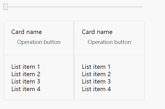
</nl:Space>自定义Size
很多时候,内建的大小不满足设计师的要求,我们可以通过传入自己定义的大小 (数值类型) 来设置。
<nl:Space Direction="Vertical" Size="30">
    <Slider
        x:Name="Slider"
        Maximum="100"
        Minimum="0" />
    <nl:Space Size="{Binding ElementName=Slider, Path=Value}">
        <nl:Card>
            <nl:Card.Header>
                <StackPanel Orientation="Vertical">
                    <TextBlock Text="Card name" />
                    <Button nl:ButtonAssist.IsText="True" Content="Operation button" />
                </StackPanel>
            </nl:Card.Header>
            <StackPanel Orientation="Vertical">
                <TextBlock Text="List item 1" />
                <TextBlock Text="List item 2" />
                <TextBlock Text="List item 3" />
                <TextBlock Text="List item 4" />
            </StackPanel>
        </nl:Card>
    </nl:Space>
</nl:Space>
自动换行
利用Wrap属性控制换行

<nl:Space IsWrap="True">
    <Button Content="Text Button" />
    <Button Content="Text Button" />
    <Button Content="Text Button" />
    <Button Content="Text Button" />
    <Button Content="Text Button" />

    <Button Content="Text Button" />
    <Button Content="Text Button" />
    <Button Content="Text Button" />
    <Button Content="Text Button" />
    <Button Content="Text Button" />

    <Button Content="Text Button" />
    <Button Content="Text Button" />
    <Button Content="Text Button" />
    <Button Content="Text Button" />
    <Button Content="Text Button" />

    <Button Content="Text Button" />
    <Button Content="Text Button" />
    <Button Content="Text Button" />
    <Button Content="Text Button" />
    <Button Content="Text Button" />
</nl:Space>