Collapse 折叠面板
原创2024年4月25日大约 3 分钟
基础用法
可同时展开多个面板,面板之间不影响
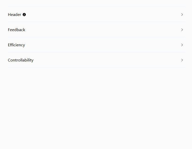
<nl:Collapse>
    <nl:CollapseItem TitleTemplate="{StaticResource DefineHeader}">
        <TextBlock TextWrapping="Wrap">
            <Run>
                Consistent with real life: in line with the process and logic of real
                life, and comply with languages and habits that the users are used to;
            </Run>
            <LineBreak />
            <Run>
                Consistent within interface: all elements should be consistent, such
                as: design style, icons and texts, position of elements, etc.
            </Run>
        </TextBlock>
    </nl:CollapseItem>
    <nl:CollapseItem Title="Feedback">
        <TextBlock TextWrapping="Wrap">
            <Run>
                Operation feedback: enable the users to clearly perceive their
                operations by style updates and interactive effects;
            </Run>
            <LineBreak />
            <Run>
                Visual feedback: reflect current state by updating or rearranging
                elements of the page.
            </Run>
        </TextBlock>
    </nl:CollapseItem>
    <nl:CollapseItem Title="Efficiency">
        <TextBlock TextWrapping="Wrap">
            <Run>Simplify the process: keep operating process simple and intuitive;</Run>
            <LineBreak />
            <Run>
                Definite and clear: enunciate your intentions clearly so that the
                users can quickly understand and make decisions;
            </Run>
            <LineBreak />
            <Run>
                Easy to identify: the interface should be straightforward, which helps
                the users to identify and frees them from memorizing and recalling.
            </Run>
        </TextBlock>
    </nl:CollapseItem>
    <nl:CollapseItem Title="Controllability">
        <TextBlock TextWrapping="Wrap">
            <Run>
                Decision making: giving advices about operations is acceptable, but do
                not make decisions for the users;
            </Run>
            <LineBreak />
            <Run>
                Controlled consequences: users should be granted the freedom to
                operate, including canceling, aborting or terminating current
                operation.
            </Run>
        </TextBlock>
    </nl:CollapseItem>
</nl:Collapse>
手风琴效果
每次只能展开一个面板
通过IsAccordion属性来设置是否以手风琴模式显示
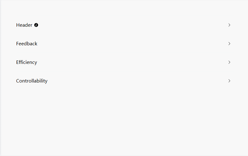
<nl:Collapse Margin="20" IsAccordion="True">
<nl:CollapseItem TitleTemplate="{StaticResource DefineHeader}">
<TextBlock TextWrapping="Wrap">
<Run>
Consistent with real life: in line with the process and logic of real
life, and comply with languages and habits that the users are used to;
</Run>
<LineBreak />
<Run>
Consistent within interface: all elements should be consistent, such
as: design style, icons and texts, position of elements, etc.
</Run>
</TextBlock>
</nl:CollapseItem>
<nl:CollapseItem Title="Feedback">
<TextBlock TextWrapping="Wrap">
<Run>
Operation feedback: enable the users to clearly perceive their
operations by style updates and interactive effects;
</Run>
<LineBreak />
<Run>
Visual feedback: reflect current state by updating or rearranging
elements of the page.
</Run>
</TextBlock>
</nl:CollapseItem>
<nl:CollapseItem Title="Efficiency">
<TextBlock TextWrapping="Wrap">
<Run>Simplify the process: keep operating process simple and intuitive;</Run>
<LineBreak />
<Run>
Definite and clear: enunciate your intentions clearly so that the
users can quickly understand and make decisions;
</Run>
<LineBreak />
<Run>
Easy to identify: the interface should be straightforward, which helps
the users to identify and frees them from memorizing and recalling.
</Run>
</TextBlock>
</nl:CollapseItem>
<nl:CollapseItem Title="Controllability">
<TextBlock TextWrapping="Wrap">
<Run>
Decision making: giving advices about operations is acceptable, but do
not make decisions for the users;
</Run>
<LineBreak />
<Run>
Controlled consequences: users should be granted the freedom to
operate, including canceling, aborting or terminating current
operation.
</Run>
</TextBlock>
</nl:CollapseItem>
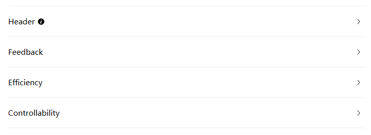
</nl:Collapse>自定义面板标题
除了可以通过Title属性之外,还可以通过目标TitleTemplate来实现自定义面板标题内容,以实现增加图标等效果
<DataTemplate x:Key="DefineHeader">
    <StackPanel Orientation="Horizontal">
        <TextBlock Margin="0,0,5,0" Text="Header" />
        <Path
            Width="10"
            Height="10"
            Fill="Black"
            Stretch="Uniform">
            <Path.Data>
                <Geometry>M512 64a448 448 0 1 1 0 896.064A448 448 0 0 1 512 64m67.2 275.072c33.28 0 60.288-23.104 60.288-57.344s-27.072-57.344-60.288-57.344c-33.28 0-60.16 23.104-60.16 57.344s26.88 57.344 60.16 57.344M590.912 699.2c0-6.848 2.368-24.64 1.024-34.752l-52.608 60.544c-10.88 11.456-24.512 19.392-30.912 17.28a12.992 12.992 0 0 1-8.256-14.72l87.68-276.992c7.168-35.136-12.544-67.2-54.336-71.296-44.096 0-108.992 44.736-148.48 101.504 0 6.784-1.28 23.68.064 33.792l52.544-60.608c10.88-11.328 23.552-19.328 29.952-17.152a12.8 12.8 0 0 1 7.808 16.128L388.48 728.576c-10.048 32.256 8.96 63.872 55.04 71.04 67.84 0 107.904-43.648 147.456-100.416z</Geometry>
            </Path.Data>
        </Path>
    </StackPanel>
</DataTemplate>

<nl:Collapse Margin="20" IsAccordion="True">
     <nl:CollapseItem TitleTemplate="{StaticResource DefineHeader}">
         <TextBlock TextWrapping="Wrap">
             <Run>
                 Consistent with real life: in line with the process and logic of real
                 life, and comply with languages and habits that the users are used to;
             </Run>
             <LineBreak />
             <Run>
                 Consistent within interface: all elements should be consistent, such
                 as: design style, icons and texts, position of elements, etc.
             </Run>
         </TextBlock>
     </nl:CollapseItem>
      <nl:CollapseItem Title="Feedback">
     <TextBlock TextWrapping="Wrap">
         <Run>
             Operation feedback: enable the users to clearly perceive their
             operations by style updates and interactive effects;
         </Run>
         <LineBreak />
         <Run>
             Visual feedback: reflect current state by updating or rearranging
             elements of the page.
         </Run>
     </TextBlock>
    </nl:CollapseItem>
 </nl:Collapse>