Card 卡片
原创2024年4月30日大约 1 分钟
基础用法
Card 组件由Header body 和 footer组成。 header 和 footer是可选的,其内容取决于它们的模板
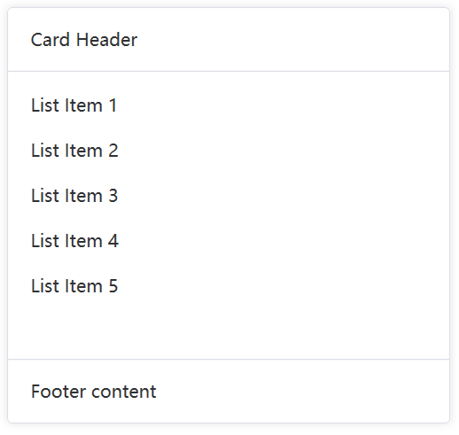
<nl:Card Width="400">
    <nl:Card.Header>
        <TextBlock Text="Card Header" />
    </nl:Card.Header>
    <TextBlock>
        <Run Text="List Item 1" />
        <LineBreak />
        <LineBreak />
        <Run Text="List Item 2" />
        <LineBreak />
        <LineBreak />
        <Run Text="List Item 3" />
        <LineBreak />
        <LineBreak />
        <Run Text="List Item 4" />
    </TextBlock>
    <nl:Card.Footer>
        <TextBlock Text="Footer content" />
    </nl:Card.Footer>
</nl:Card>
简单卡片
卡片可以只有内容区域
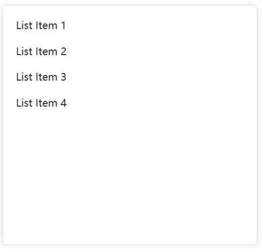
<nl:Card Width="400">
    <TextBlock>
        <Run Text="List Item 1" />
        <LineBreak />
        <LineBreak />
        <Run Text="List Item 2" />
        <LineBreak />
        <LineBreak />
        <Run Text="List Item 3" />
        <LineBreak />
        <LineBreak />
        <Run Text="List Item 4" />
    </TextBlock>
</nl:Card>
有图片内容的卡片
可配置定义更丰富的内容展示。
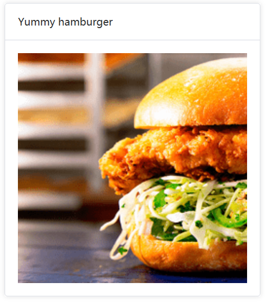
<nl:Card Width="400">
    <nl:Card.Header>
        <TextBlock Text="Yummy hamburger" />
    </nl:Card.Header>
    <Image Source="https://shadow.elemecdn.com/app/element/hamburger.9cf7b091-55e9-11e9-a976-7f4d0b07eef6.png" Stretch="Uniform" />
</nl:Card>
带有阴影效果的卡片
你可以定义什么时候展示卡片的阴影效果。
通过 Shadow 属性设置卡片阴影出现的时机。 该属性的值可以是:Always、Hover 或 Never。
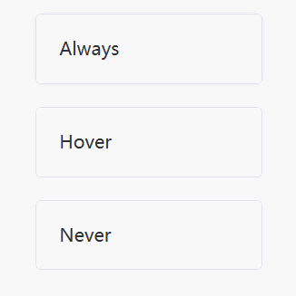
<nl:Card Width="200" Shadow="Always">
    <TextBlock Text="Always" />
</nl:Card>

<nl:Card Width="200" Shadow="Hover">
    <TextBlock Text="Hover" />
</nl:Card>

<nl:Card Width="200" Shadow="Never">
    <TextBlock Text="Never" />
</nl:Card>