Alert 提示
原创2024年4月29日大约 2 分钟
基础用法
Alert组件不属于浮层元素,不会自动消失或关闭。
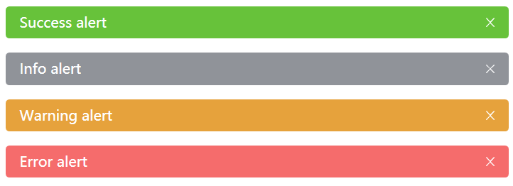
Alert组件提供四种类型,由Type属性指定,默认为Info。
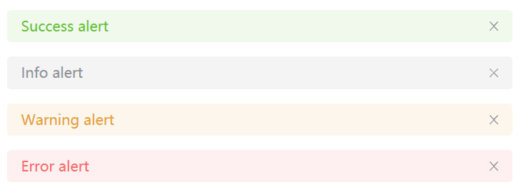
<nl:Alert Type="Success">Success alert</nl:Alert>
<nl:Alert Type="Info">Info alert</nl:Alert>
<nl:Alert Type="Warning">Warning alert</nl:Alert>
<nl:Alert Type="Error">Error alert</nl:Alert>
自定义关闭按钮
你可以自定义关闭按钮为文字或其他符号。
你可以设置 Alert 组件是否为可关闭状态, 关闭按钮的内容以及关闭时的回调函数同样可以定制。 Closable 属性决定 Alert 组件是否可关闭, 该属性接受一个Boolean,默认为false。 你可以设置CloseText属性来代替右侧的关闭图标, 需要注意的是closetext必须是一个字符串。 当 Alert 组件被关闭时会触发 close 事件。
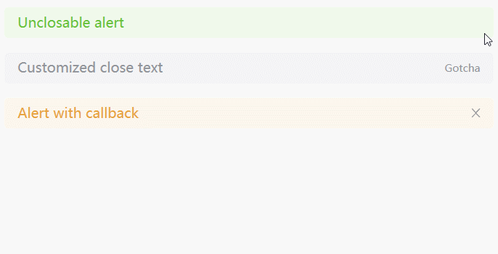
<nl:Alert Closable="False" Type="Success">Unclosable alert</nl:Alert>
<nl:Alert CloseText="Gotcha" Type="Info">Customized close text</nl:Alert>
<nl:Alert Close="AlertItem_Close" Type="Warning">Alert with callback</nl:Alert>
private void AlertItem_Close(object sender, RoutedEventArgs e)
{
MessageBox.Show("Hello World");
}使用图标
你可以通过为Alert组件添加图标来提高可读性。
通过设置ShowIcon属性来显示Alert的Icon,这能更有效地向用户展示你的显示意图。
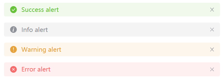
<nl:Alert ShowIcon="True" Type="Success">Success alert</nl:Alert>
<nl:Alert ShowIcon="True" Type="Info">Info alert</nl:Alert>
<nl:Alert ShowIcon="True" Type="Warning">Warning alert</nl:Alert>
<nl:Alert ShowIcon="True" Type="Error">Error alert</nl:Alert>
文字居中
使用IsCenter属性来让文字水平居中
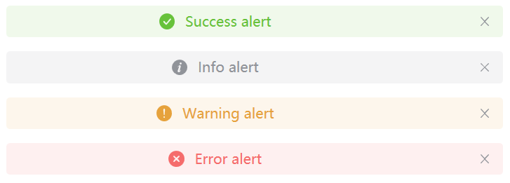
<nl:Alert IsCenter="True" ShowIcon="True" Type="Success">
    Success alert
</nl:Alert>
<nl:Alert IsCenter="True" ShowIcon="True" Type="Info">
    Info alert
</nl:Alert>
<nl:Alert IsCenter="True" ShowIcon="True" Type="Warning">
    Warning alert
</nl:Alert>
<nl:Alert IsCenter="True" ShowIcon="True" Type="Error">
    Error alert
</nl:Alert>
文字描述
为 Alert 组件添加一个更加详细的描述来使用户了解更多信息。
除了必填的Title属性外,你可以设置Content属性来帮助你更好地介绍,我们称之为辅助性文字。 辅助性文字只能存放文本内容,当内容超出长度限制时会自动换行显示。
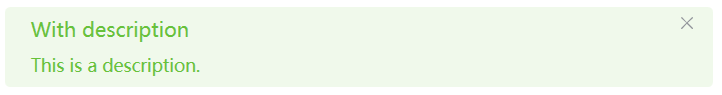
<nl:Alert Title="With description" Type="Success">This is a description.</nl:Alert>带图标和描述
这是一个带有图标和描述的例子。
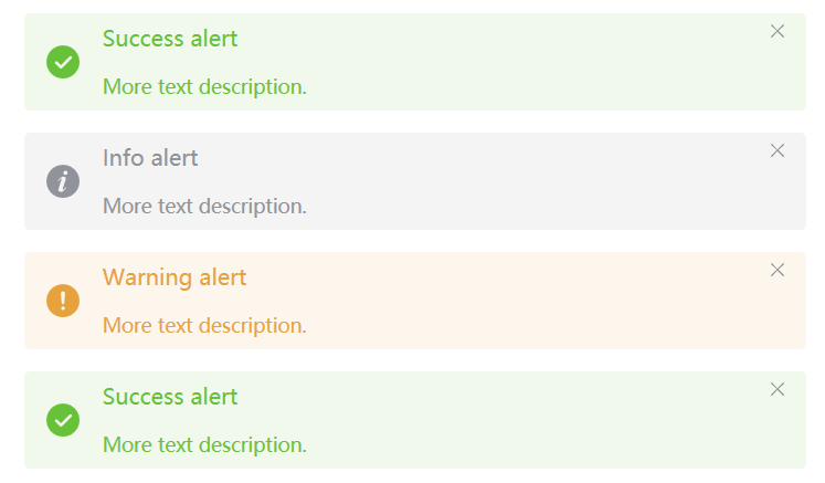
<nl:Alert Title="Success alert" ShowIcon="True" Type="Success">
    More text description.
</nl:Alert>
<nl:Alert Title="Info alert" ShowIcon="True" Type="Info">
    More text description.
</nl:Alert>
<nl:Alert Title="Warning alert" ShowIcon="True" Type="Warning">
    More text description.
</nl:Alert>
<nl:Alert Title="Success alert" ShowIcon="True" Type="Success">
    More text description.
</nl:Alert>
主题样式
IsDark属性设置主题样式,默认False,即为Light主题
<nl:Alert IsDark="True" Type="Success">Success alert</nl:Alert>
<nl:Alert IsDark="True" Type="Info">Info alert</nl:Alert>
<nl:Alert IsDark="True" Type="Warning">Warning alert</nl:Alert>
<nl:Alert IsDark="True" Type="Error">Error alert</nl:Alert>